The Standard Model
A complete brand identity and visual system: Built by hand. Evolved with AI. Governed with purpose.
Standard Model Bio is a biomedical AI startup building a foundation model for human biology — medical AI trained on genomic, imaging, and longitudinal patient records to predict patient outcomes.
What began as a single “mini-brand” to help the founders meet early investors has grown into a complete identity — a brand and design system, a newly designed and built website, and an ongoing program of investor and partner pitch decks.
A startup outgrowing its first identity.
A compelling story, but no palette, logo, or landing page. We built a visual mini-brand to start — then the company kept moving, and it needed to mature into a real system that could carry a website, docs, and pitch after pitch without losing coherence.
From a molecular language to a full system.
The visual core came first — a colorful, “molecular” language built by hand and evolved with AI. From there: a complete, documented design system, a new website built in Claude Code and Claude Design, and an ongoing stream of on-brand investor and partner decks.
One system, carrying the whole company.
One coherent identity now carries the whole company — and keeps working long after launch. Every new pitch starts on-brand, and the visual language scales as they grow.
Powerplay stays on as Standard Model’s ongoing design partner, seeing to every need as it surfaces — decks, website, social, and each new product surface. We hold the fidelity of the brand and design system so it speaks with a single visual voice wherever it’s seen: a tight, consistent branded experience we created and continue to maintain.
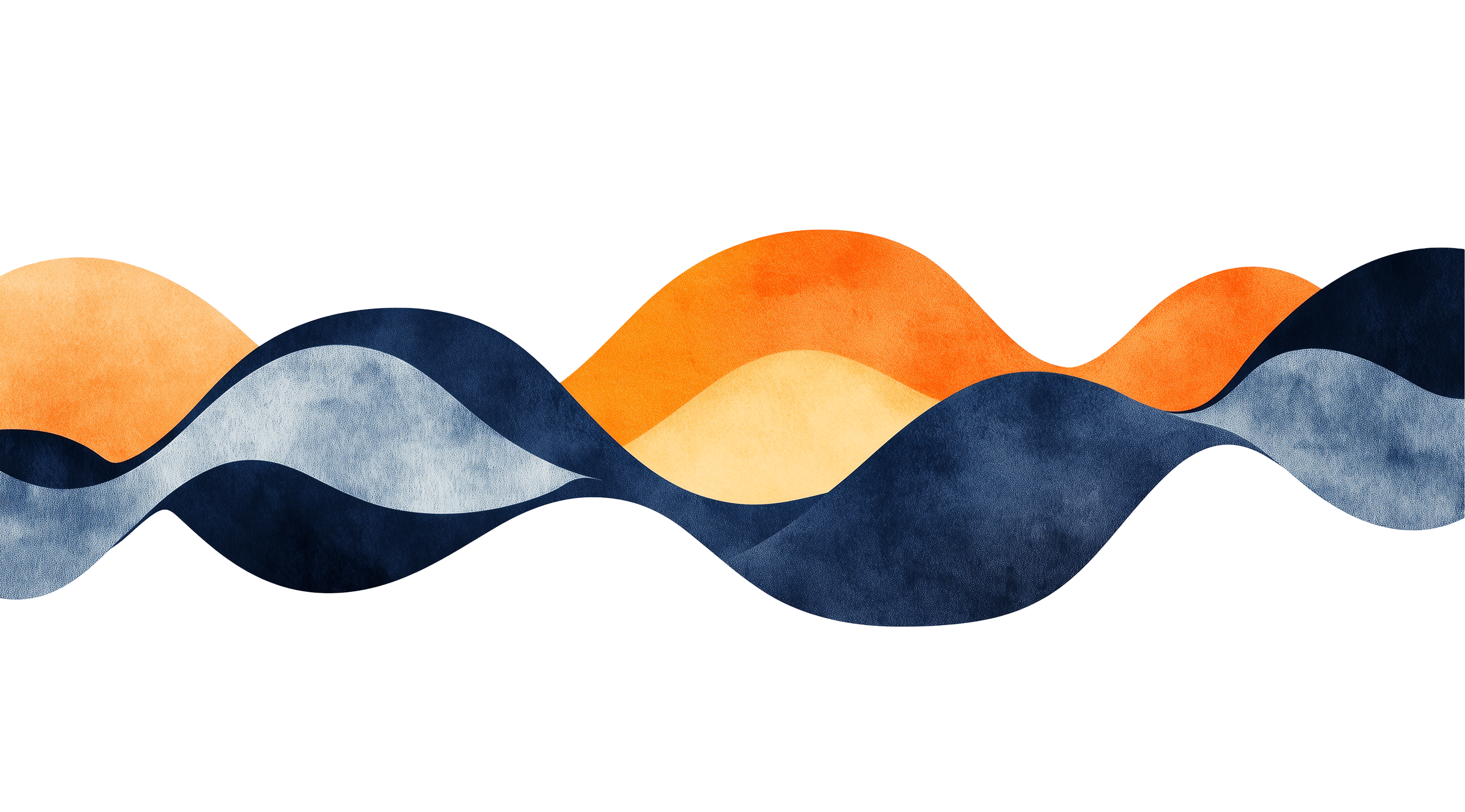
The organic language of data.
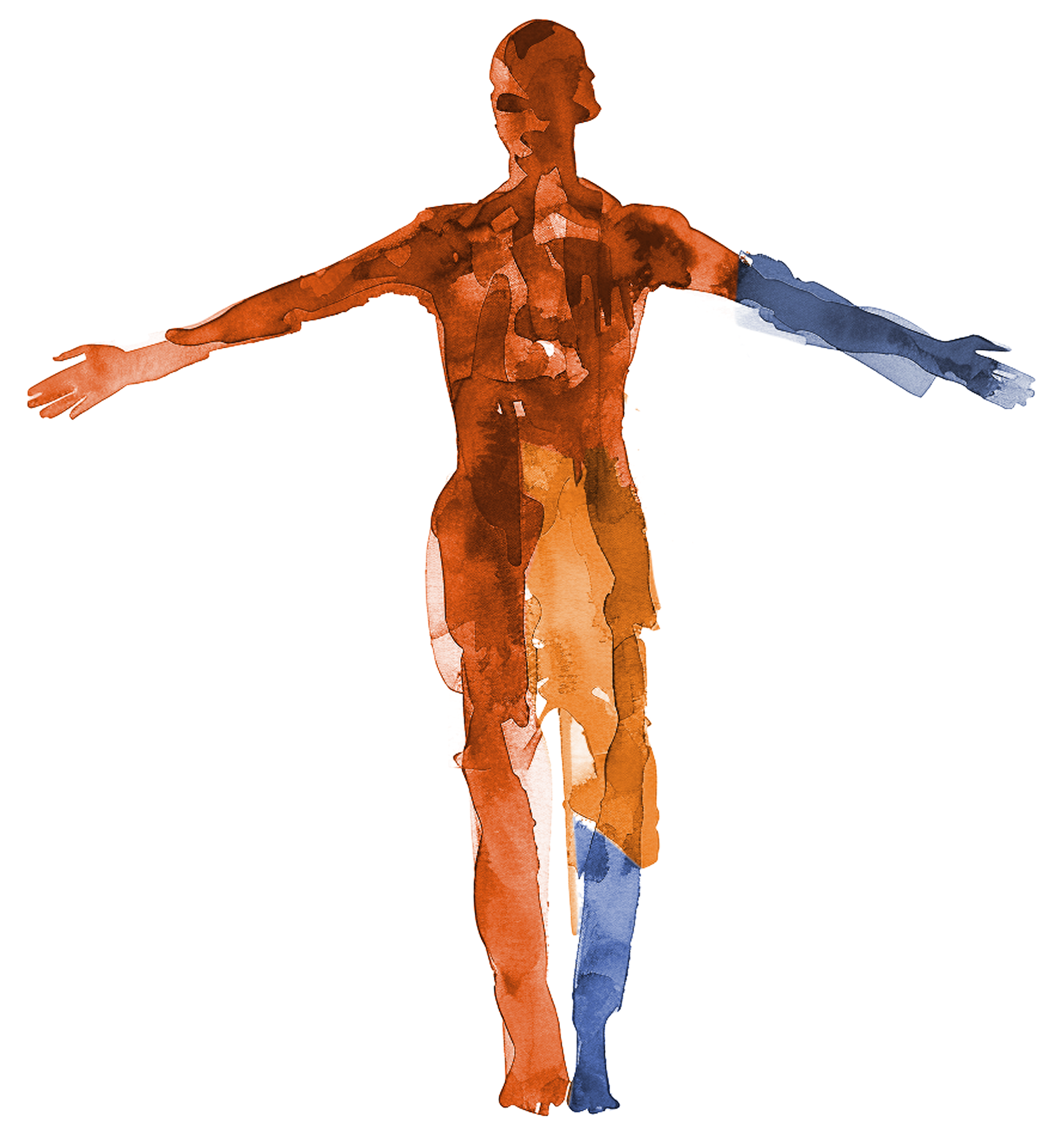
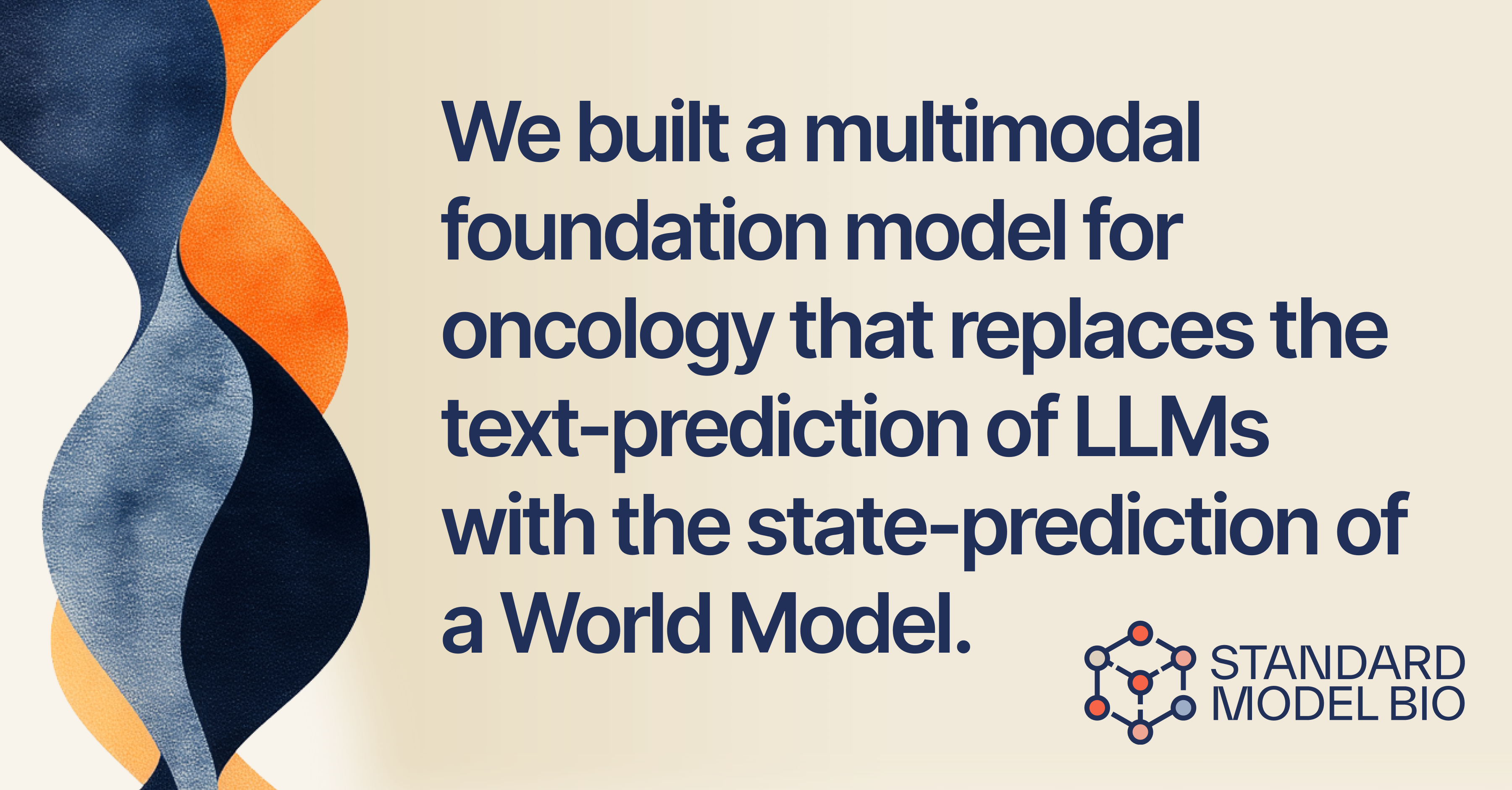
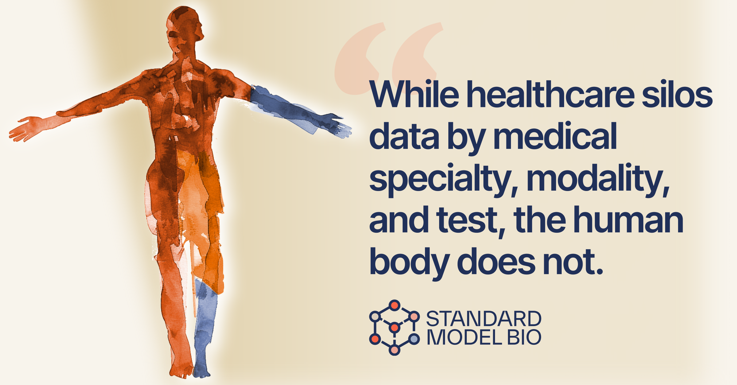
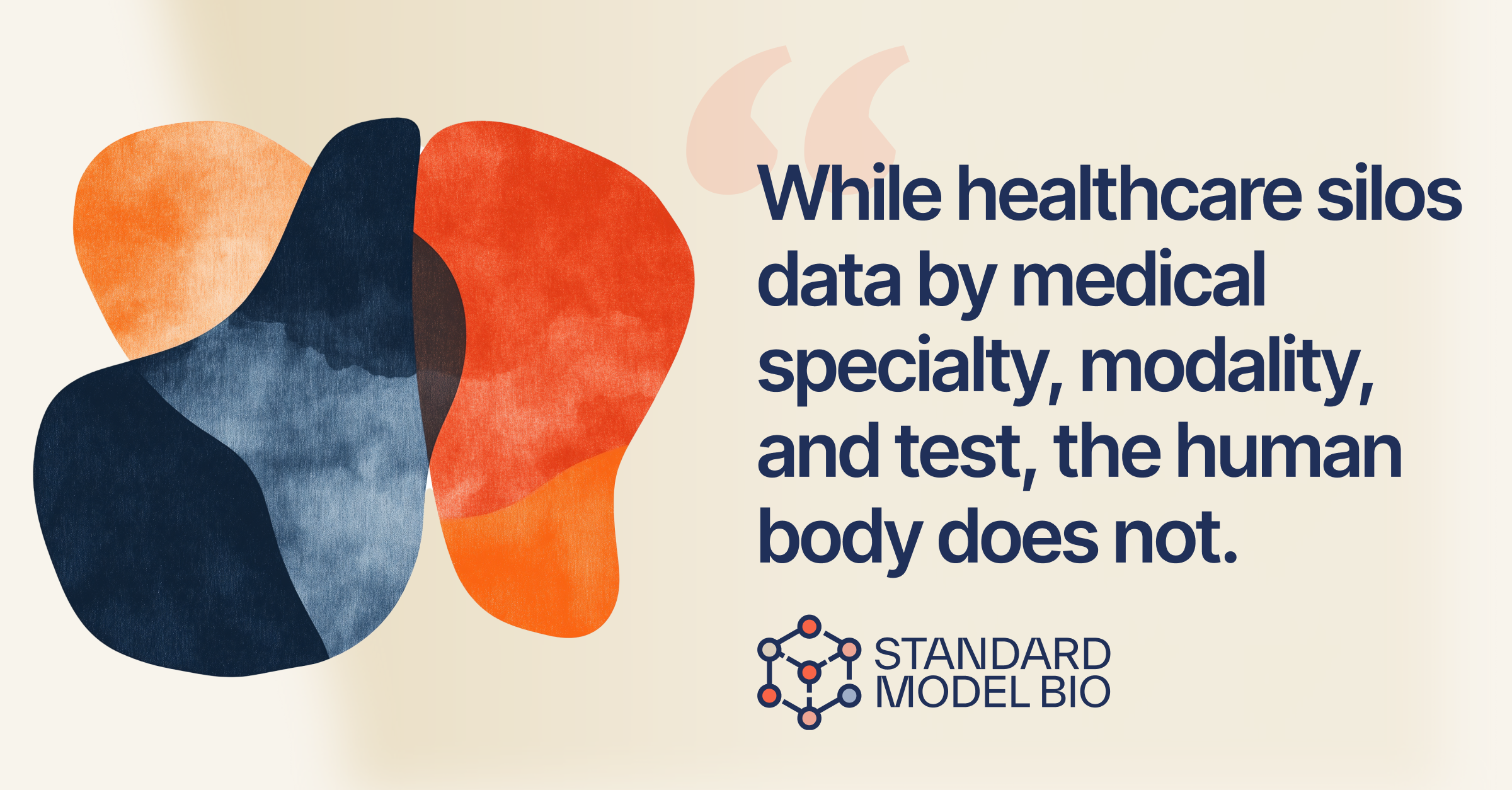
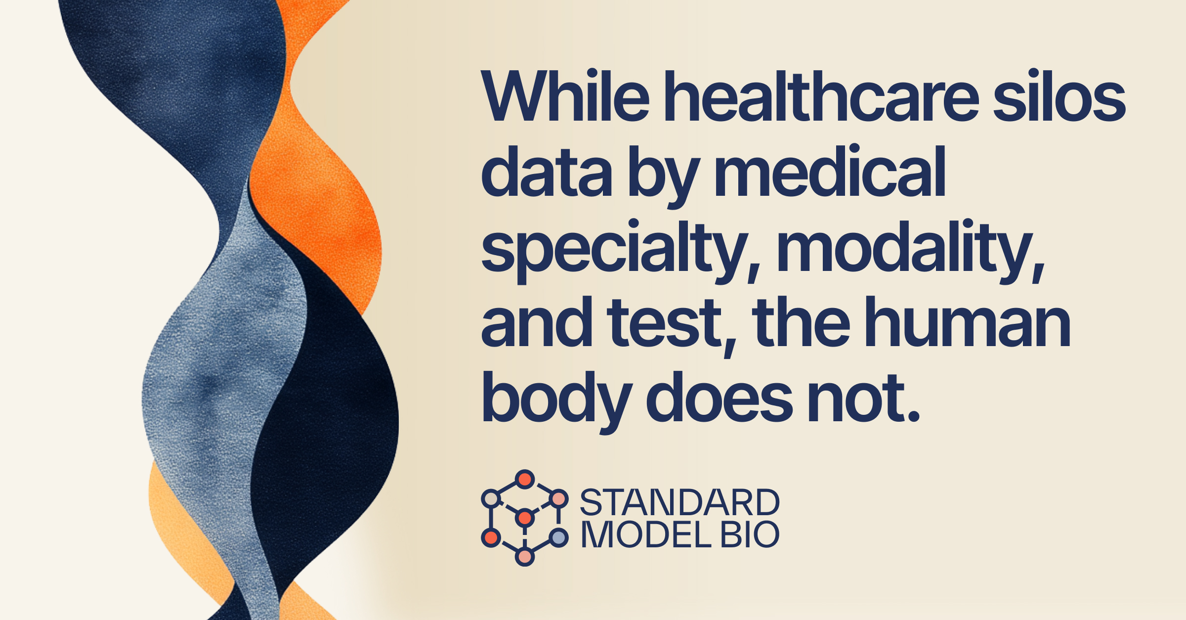
Standard Model Bio is building one model of the whole human — fragmented biomedical data resolved into a single picture of a patient. We translated that ambition into a living visual language: organic, abstract forms that read as biology, not the lab.
Our inspiration was late-period Henri Matisse — the cut-paper compositions and watercolors where simple, flowing shapes carry profound meaning. That same power of abstraction lets a single form speak to the fundamental nature of life. Warm oranges and reds sit against cooler blues to keep the human body at the center, while watercolor textures and transparent overlays echo the layered complexity of biology. The forms shift in scale, too — from small cellular structures to sweeping whole-patient systems — many systems working in harmony, each influencing the next.
No shape stands alone; each flows into the next, the way the body’s systems do. Built by hand, expanded with AI, and tuned so the science always feels fundamentally human.
From a Wix placeholder to a living flagship.
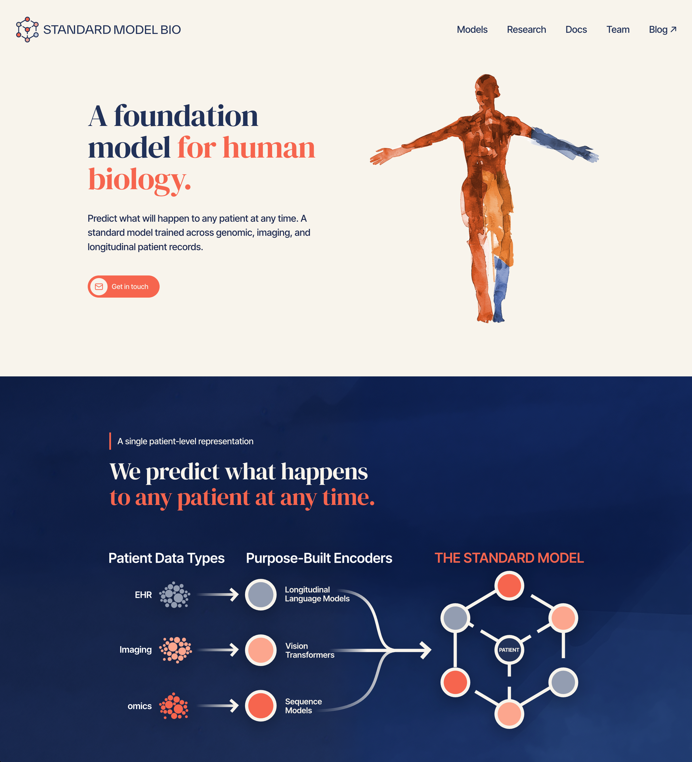
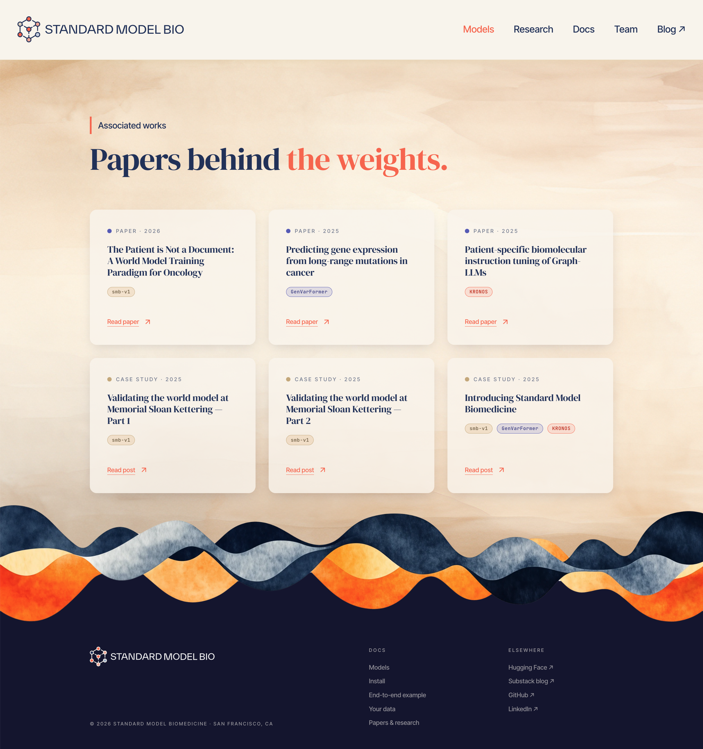
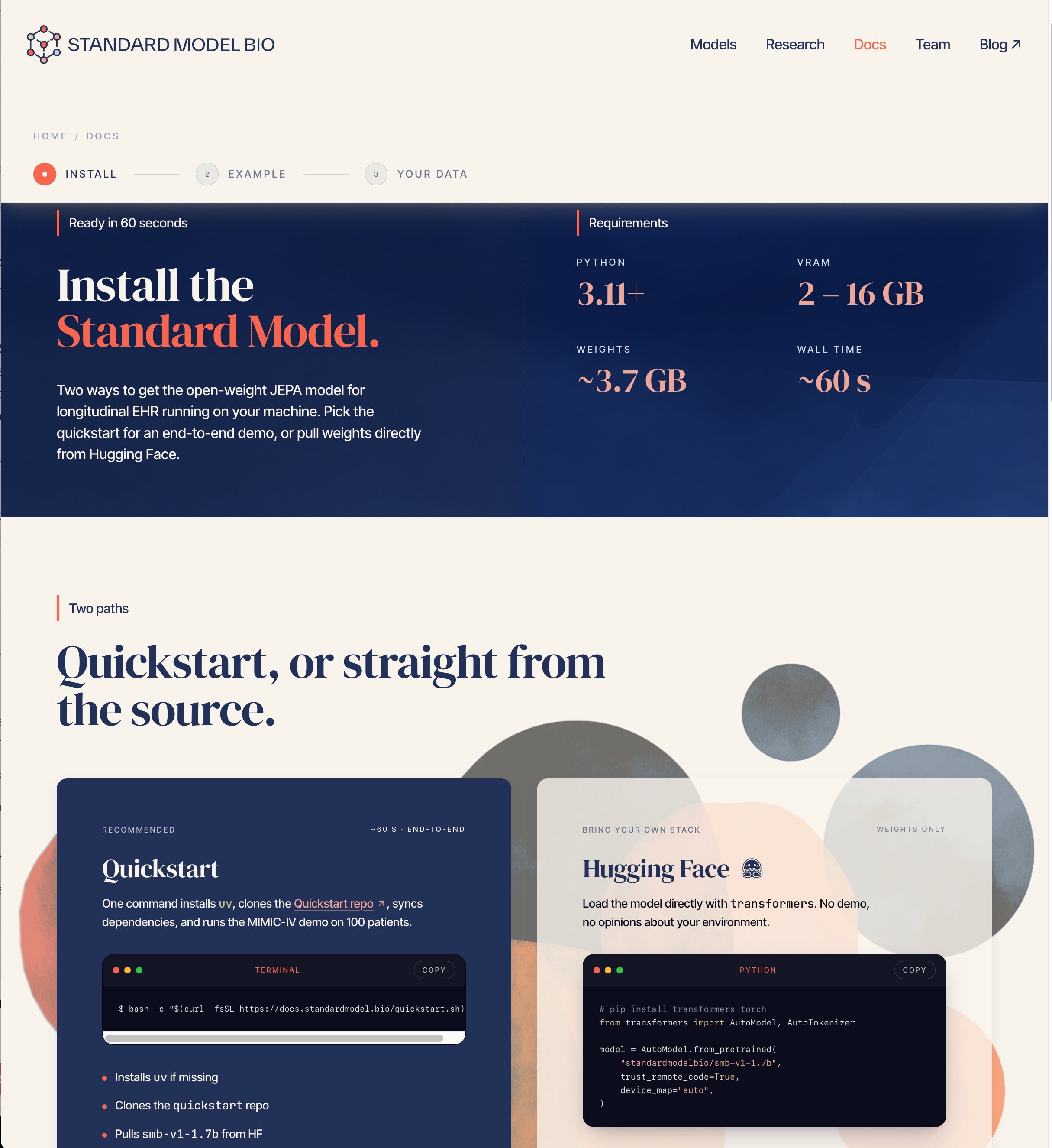
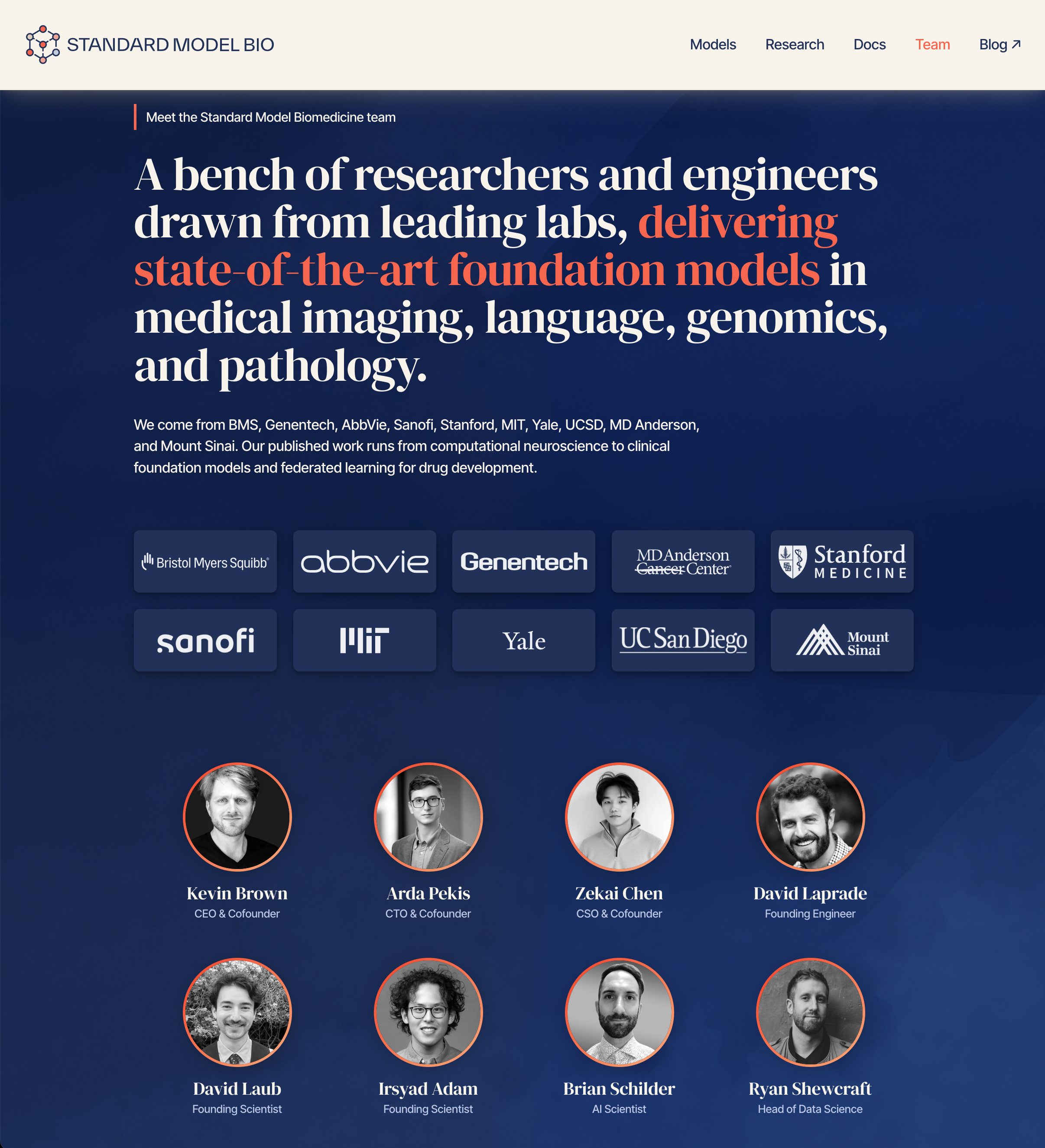
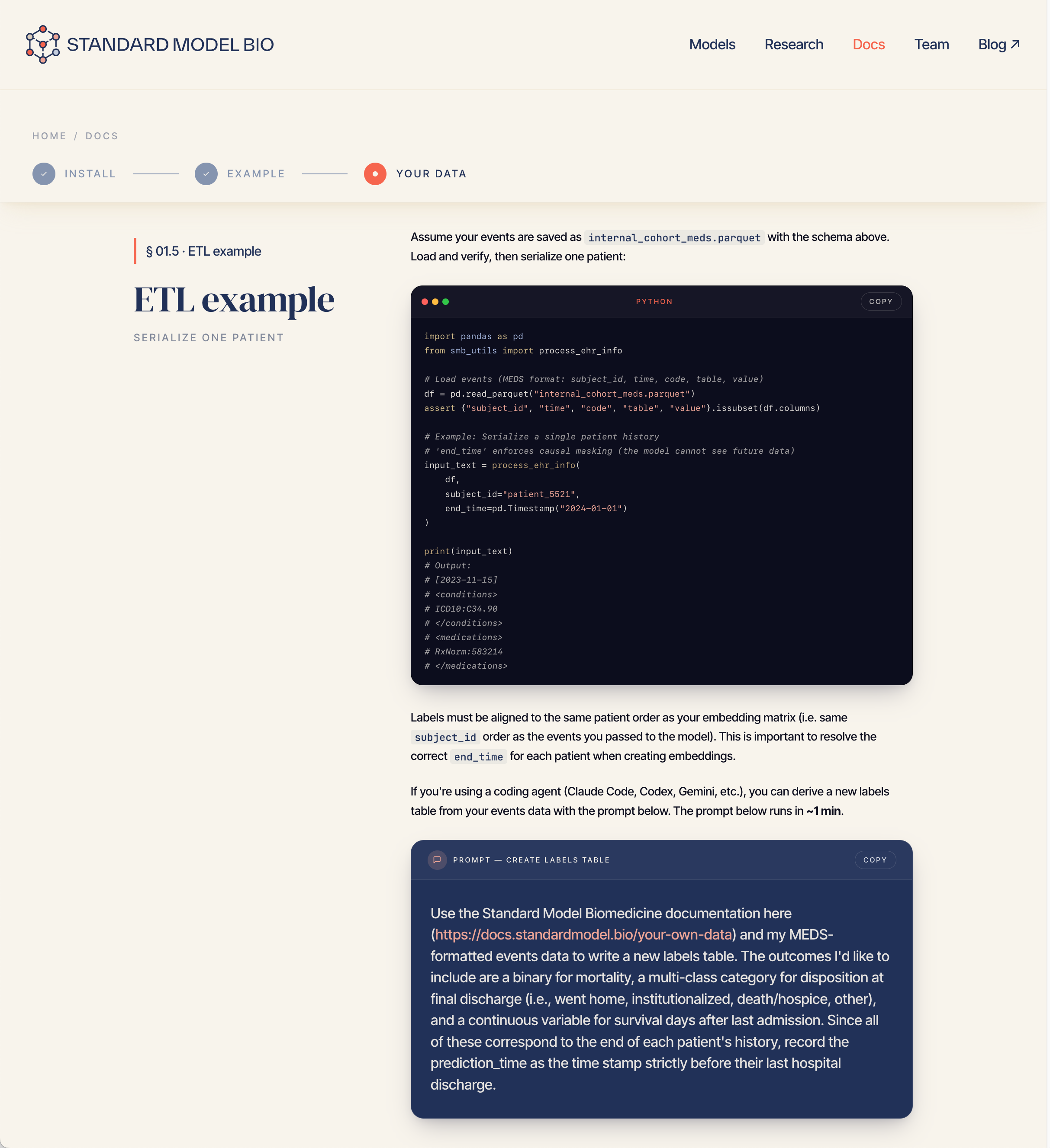
The most public surface the company has — rebuilt around the system, and actively maintained as it grows. Click any frame to view it full size.
The first site was an off-the-shelf Wix template — enough to point investors somewhere real, but generic and unmistakably not the brand. We rebuilt it organically in Figma, designing the site screen by screen and gradually folding in the identity we’d created: the molecular visuals, the full palette, DM Serif Display and Inter Tight, the custom icon set. From those Figma designs we moved into build, and it became a living document — not a hand-off — built and maintained in Claude Code and Claude Design as a working partner, which lets us evolve the site at the pace of the science while holding brand fidelity on every release.
We extend the system into social — a templated kit of profile marks, announcement cards, and quote posts sized for every channel, with a consistent grid, type hierarchy, and motion vocabulary. The result is a feed that looks composed, not assembled: campaign-ready assets the team can ship on cadence while the brand reads as one voice across every platform.
The mission, built into the mark.
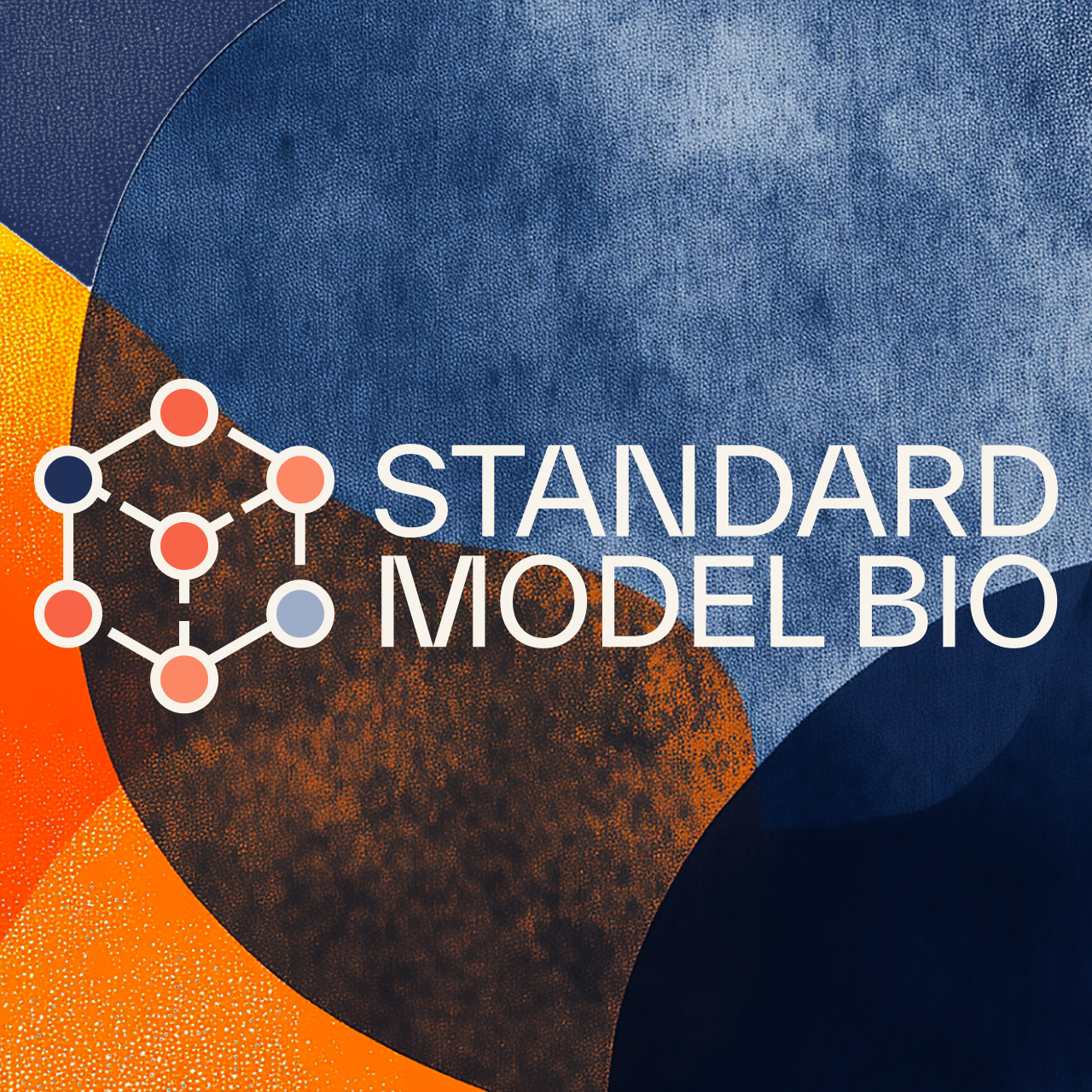
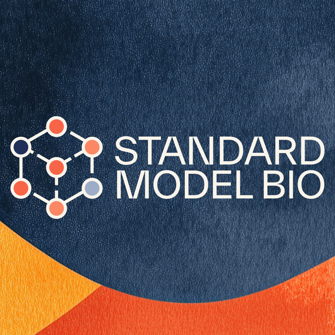
We encoded the company’s thesis directly into its symbol. Six nodes orbit a central hub — at once a chemical-bond diagram and a data graph — standing for the multimodal model itself: every biomedical signal, at every scale, unified into one representation of a patient.
The name borrows its authority from physics, where the Standard Model unifies every force under one theory. Our mark makes the same claim for biology — and holds it with one confident system of lockups, on light and dark.


A palette drawn from the body.
We read the brand’s essence and built a six-family palette that maps straight onto human biology. Cool navies and slate carry the scientific authority — the clarity of the lab, the depth of the data. Warm flames and corals carry the human presence, from the blush of living tissue to the heat of physiological intensity, with a warm brûlée tan standing in for paper and skin.
Cool and warm sit at equal weight — refusing biomedicine’s usual clichés — because the science is real, and so is the person behind every measurement.
A custom set, drawn for the science.
Sixty marks span the company’s entire world — imaging, molecular biology, data and compute, and the clinical layer. One line weight, one corner radius, and the navy-and-flame palette make any combination read as a single voice across decks, the site, and the product.
The vocabulary is unmistakably theirs — built from the science it describes, not pulled from a stock library.














Turning dense science into clear pictures.
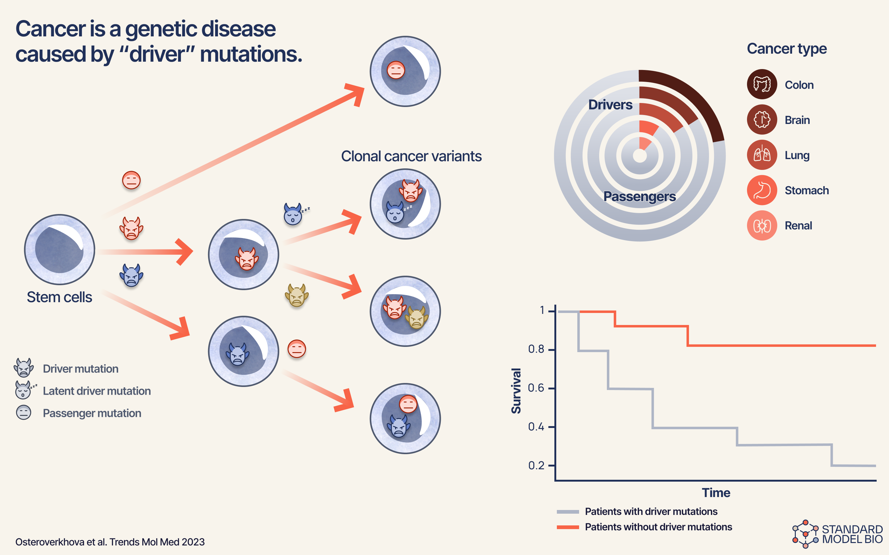
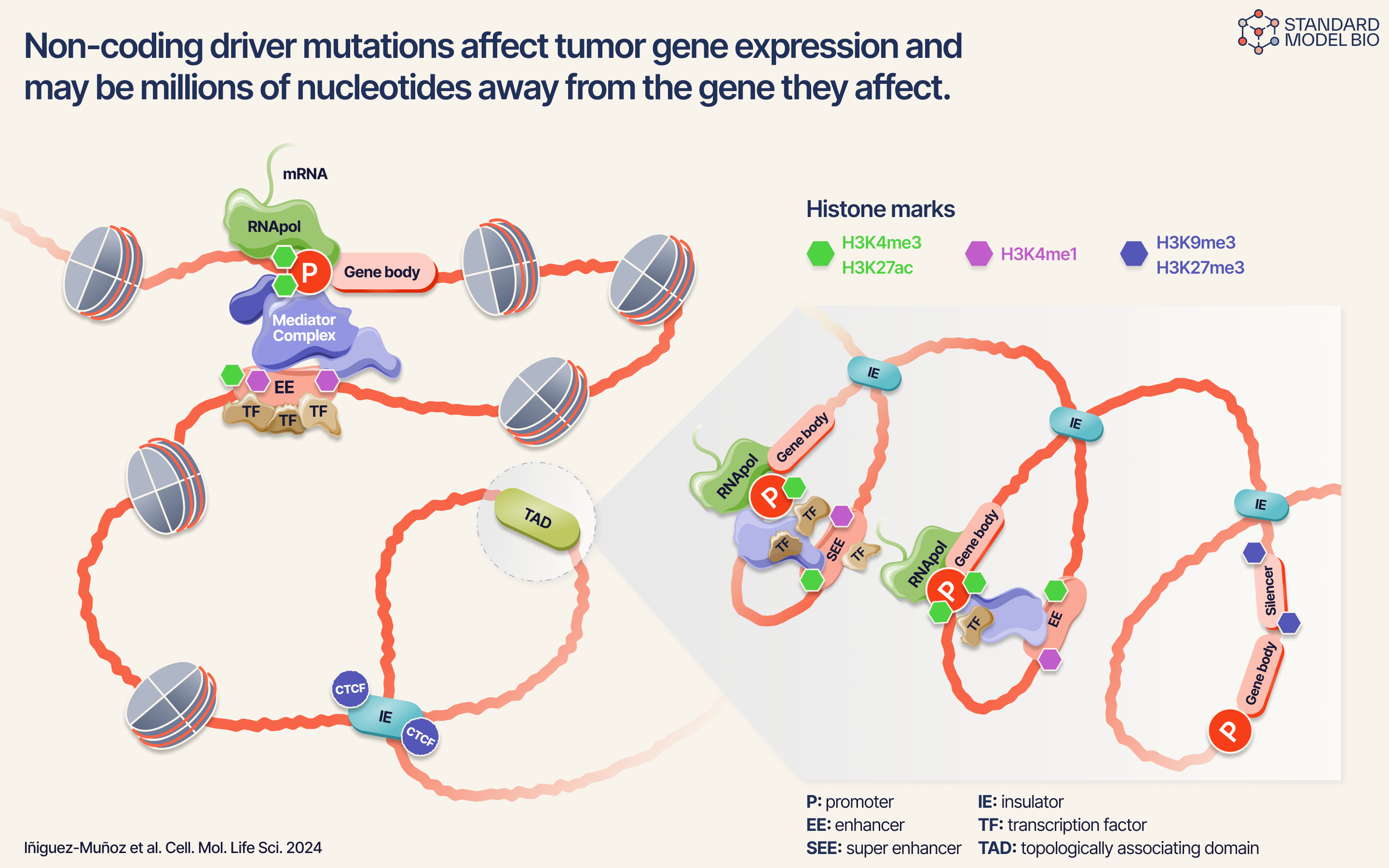
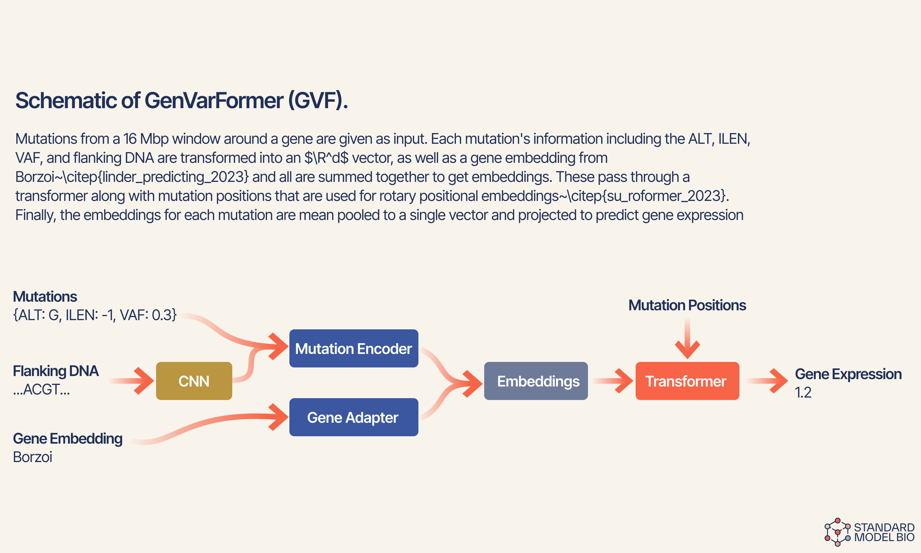
Explanatory figures for scientific publications and pitch decks. Click any diagram to view it full size.
Beyond the brand, we design the figures that carry Standard Model’s research into the world. Complex mechanisms, model architectures, and survival data — redrawn in the brand’s visual language so a reader grasps the idea at a glance. Rigorously accurate, unmistakably on-brand, and built to make hard science legible.